ELUSIVE ECHOES
SPRING 2025 TYPOGRAPHY II
Challenged with using non-tradition forms of typography to distort and create a visually interesting, complimentary series of posters while maintaining an underlying grid.
This typographic poster series focuses on the challenge of creating a cohesive visual design system that can unify multiple components while still honoring their differences. The assignment was to design a poster series that effectively communicated meaning by combining type and imagery that engaged and persuaded viewers to attend an event.

RESEARCH
The prompt, Altered Earth: Poetic Perspectives on Planetary Shifts, served as a starting point for my research. From there, I explored the three poets whose work the posters would represent. By studying their voices, styles, contributions, and more I was able to form a foundation for this visual system.


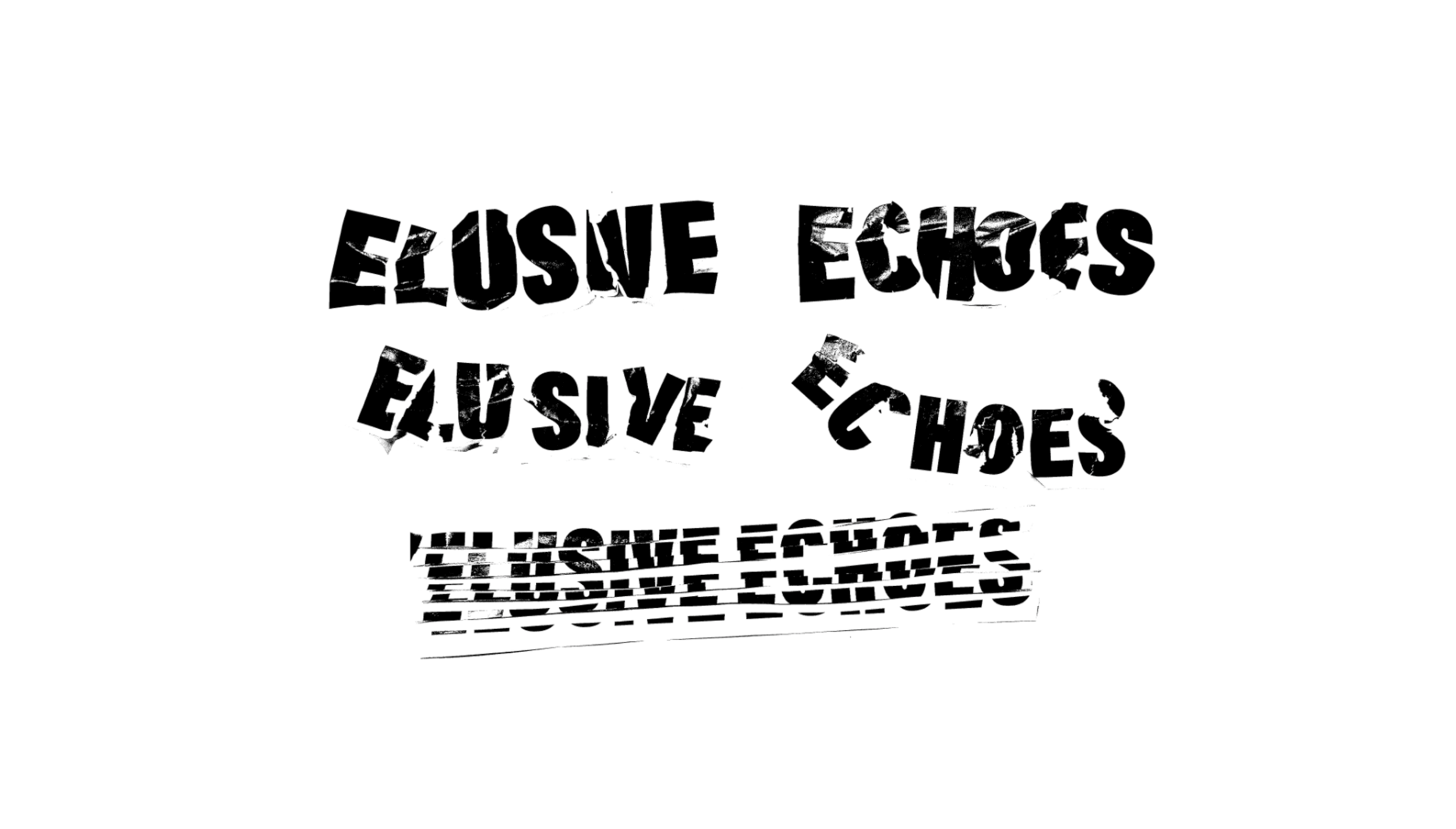
Jjjjjerome Ellis is a composer, writer, and performer whose work explores the intersections of music, literature, and Black studies. Often incorporating his experience of stuttering as both theme and method, he uses voice, saxophone, electronics, and storytelling to question how time, silence, and speech shape identity. His work invites listeners into spacious, transformative encounters with sound and language.
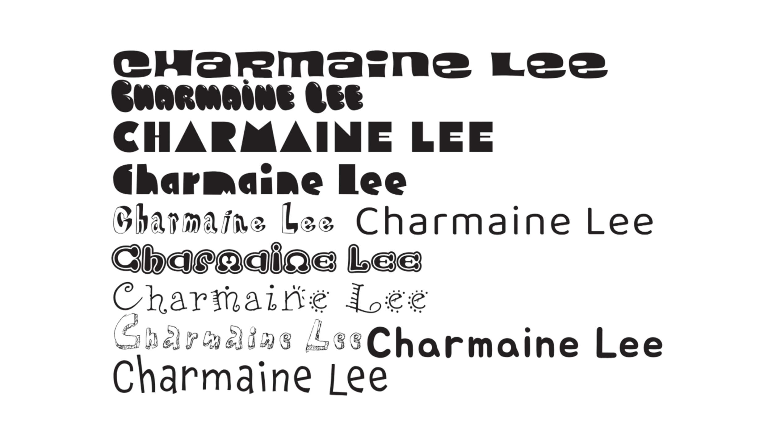
Charmaine Lee is a New York–based vocalist and sound artist known for her radical approach to the voice as an instrument. Working primarily with improvisation, she creates dense, textural soundscapes using extended vocal techniques, electronics, and amplification. Her work pushes the boundaries between noise, language, and pure sound, often inhabiting an intense and visceral sonic space.
Patti Smith is an American singer, poet, and visual artist often called the "punk poet laureate" for blending raw rock energy with literary depth. Emerging in the 1970s with her landmark album Horses, she helped shape punk’s ethos while drawing on poetry, art, and activism. Her work—spanning music, writing, and photography—explores themes of rebellion, spirituality, and the transformative power of art.
ANALOGUE AND TYPE STUDY
Building from this research, I explored multiple concept directions through experimenting with analogue typography. These early experiments allowed me to translate the poets’ themes and voices into visual form, testing different ways typography could communicate their work. This stage provided a foundation for refining the most effective visual design approach.
CONCEPT DECISION
I explored multiple overall concept directions after experimenting with analogue typography. These early sketches helped narrow down my concepts and decide which to pursue. I was able to generate specific concepts that align with my research and choose which sent the message I was looking for. Here is where I chose to pursue one design.
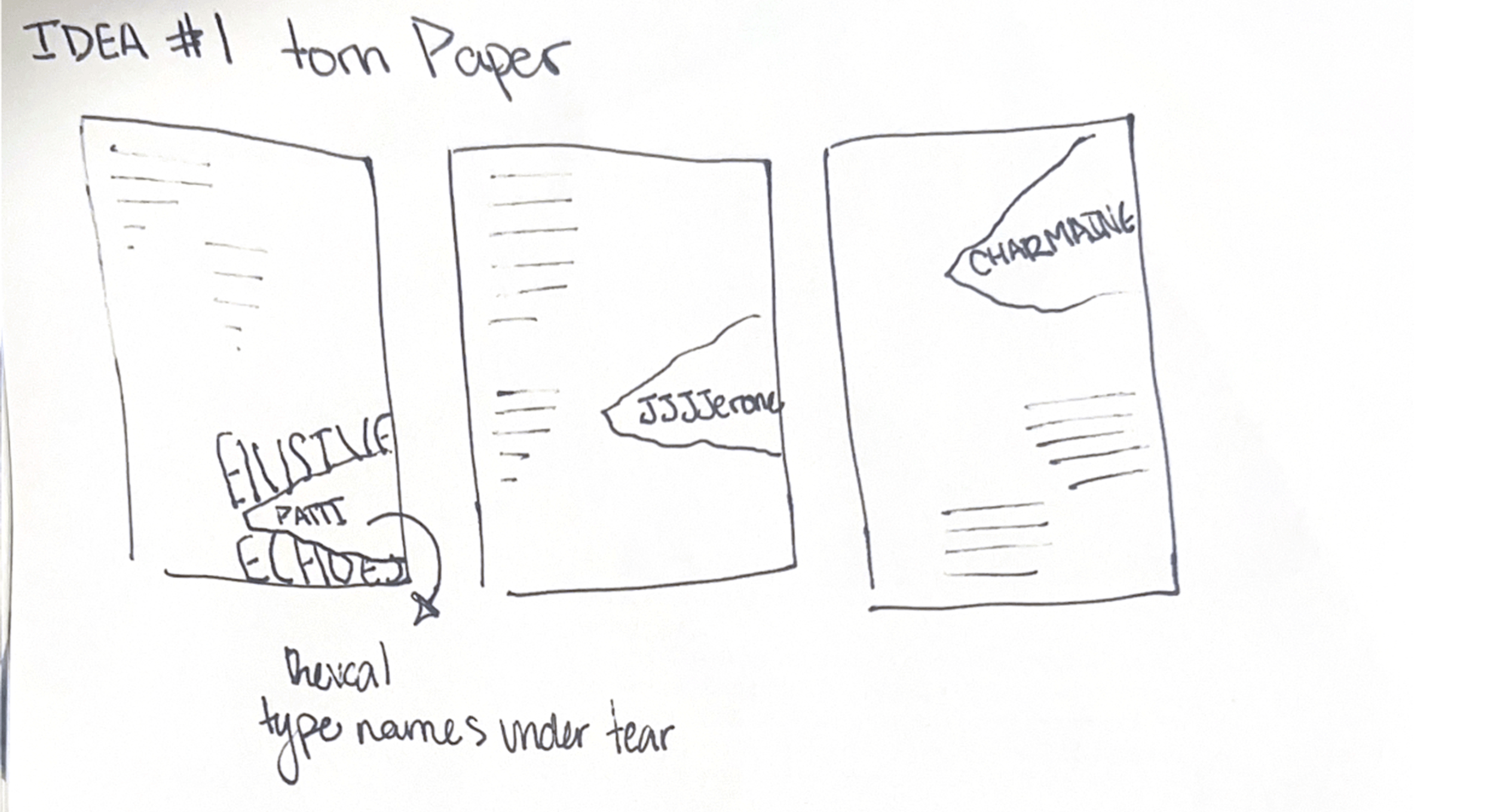
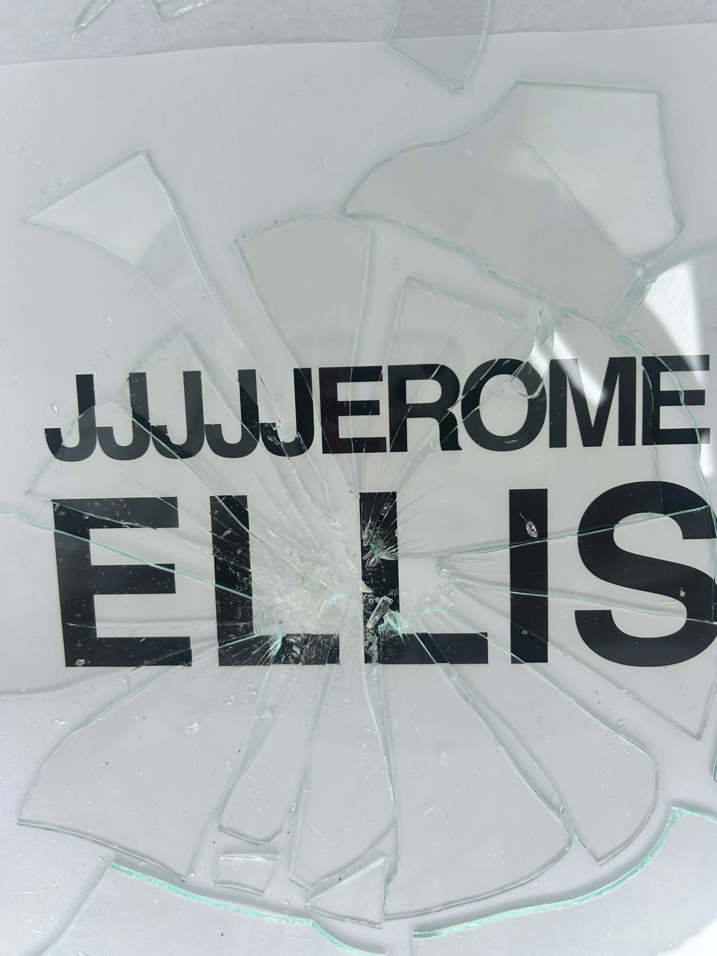


After going through the ideas I had, I chose to pursue breaking glass on top of a very simple blocky type, Helvetica, and to use the glass to alter the type to reference, breaking the rules. This was the iteration I wanted to bring digitally and go on from there.
DIGITAL ITERATION; COLOR STUDY
After deciding on a concept I brought my typography into Adobe Photoshop and played with colors, I pre-planned different color ways that were vibrant and bold to make each poster than out.
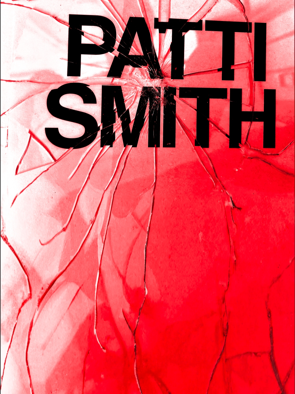


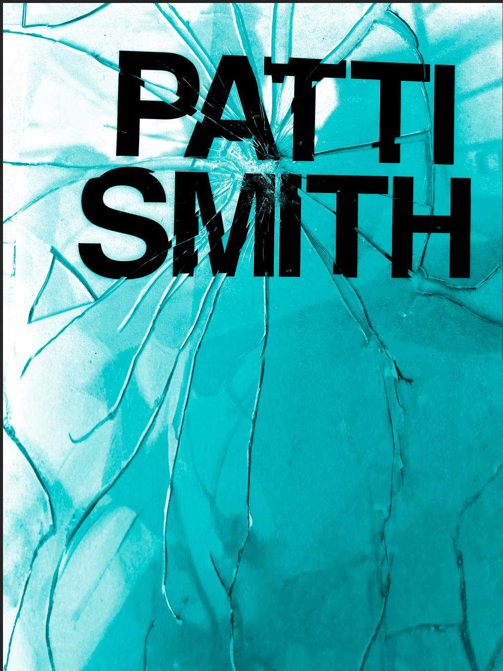


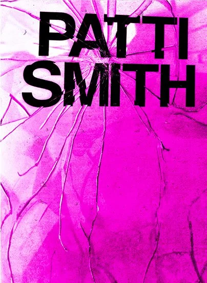


I chose this final color way because it felt the most natural with the effects that were going on in the images. As well as I felt they were bold and loud and enhanced the idea of, ‘breaking the rules’ and referenced old school punk design.
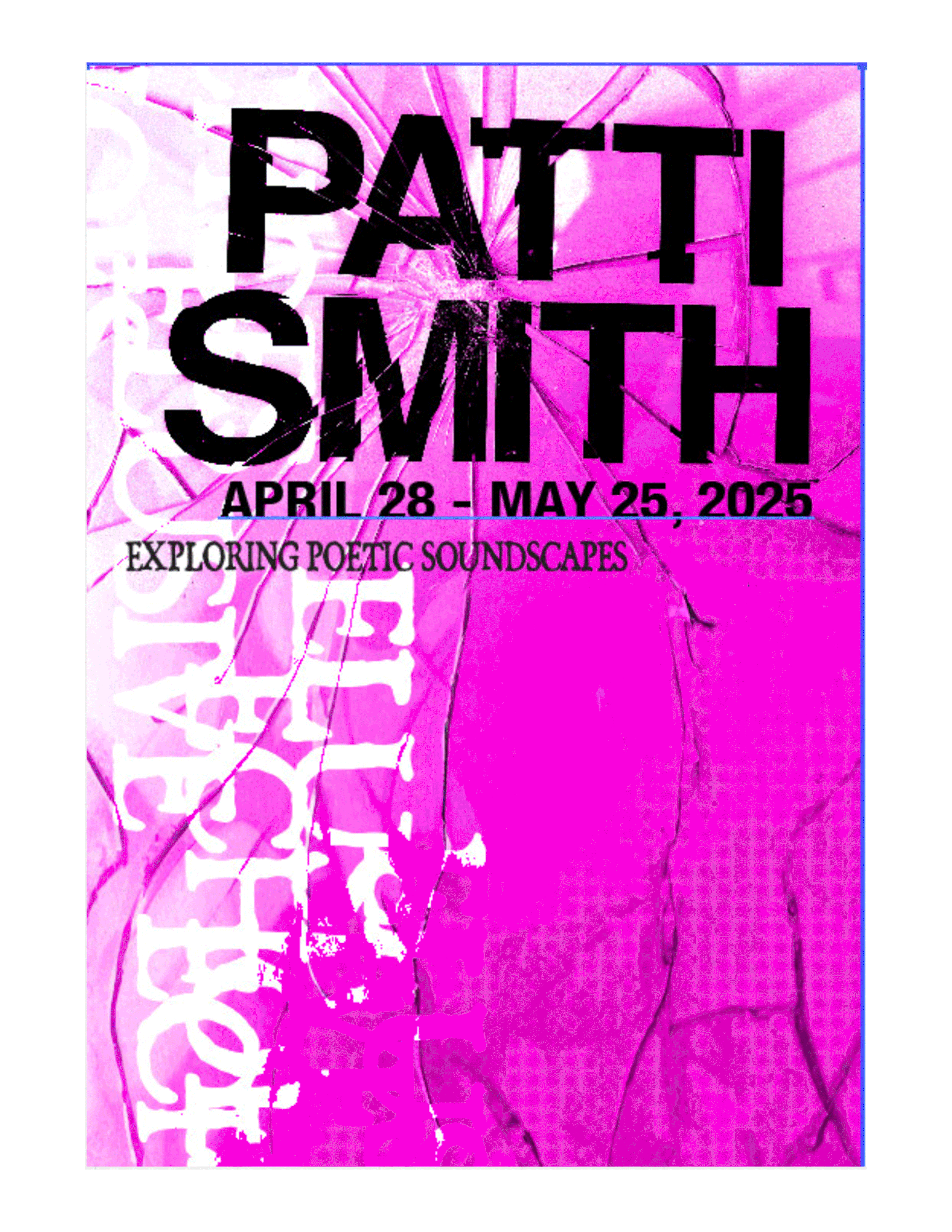
Here is where I played with different ways to layout the rest of the information required on the poster. I played with grid, typefaces and letterforms to not distract from what is already going on but to compliment and highlight the broken glass look. I landed on playing with a typewriter to layout my type to reference the punk style Patti Smith was from.
FINAL
My final posters are highlighting breaking the rules by breaking through glass. I wanted to take breaking the rules literally and portray that in my three posters. I learned so much from this project including bending the digital realm of typography and learning how I can ‘break the rules’ but still produce a clear and communicative poster system that is visually appealing. I learned what it was like to empathize with a clients goal to communicate their message in a visually appealing way while also demonstrating a clear hierarchy.


