INSTRUCTIONAL DESIGN
WINTER 2025 TYPOGRAPHY II
Challenged with creating an instructional design layout using deconstructive typography to create a visually interesting and dynamic design seeing how much a letterform can be distorted while maintaining readability
This typographic series focuses on the challenge of creating a typographic layout to an instructional piece that kept a visual heirarchy throughtout all phases but also pushed the design in all areas. Each phase was meant to push the design within restraints until in its final phase was pushed to the limits of readability.

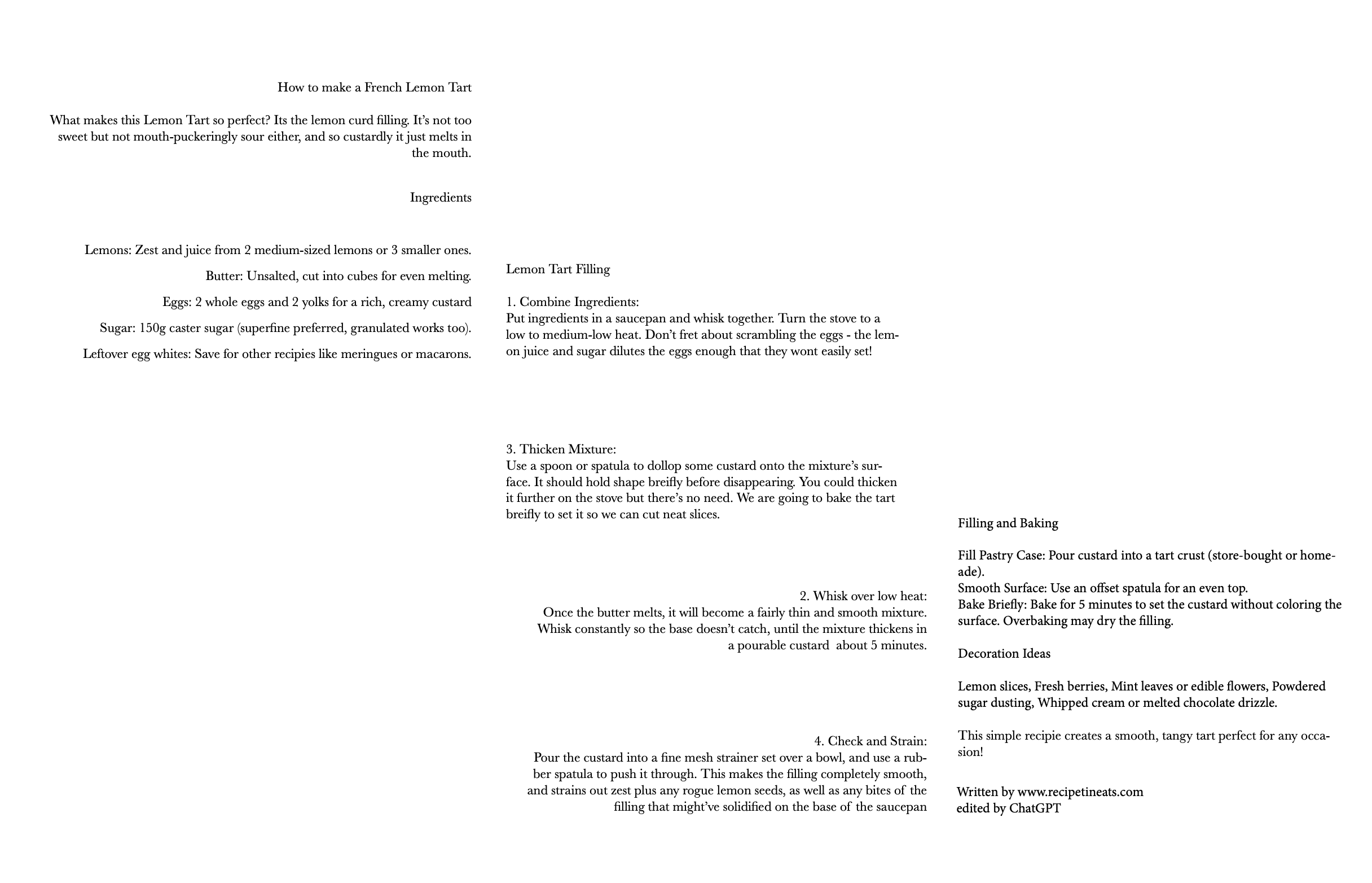
PHASE 1
Restrained to using one type size, one type eright, and one type face


PHASE 2
Restrained to using one type size and one type face, allowed to vary type weight.


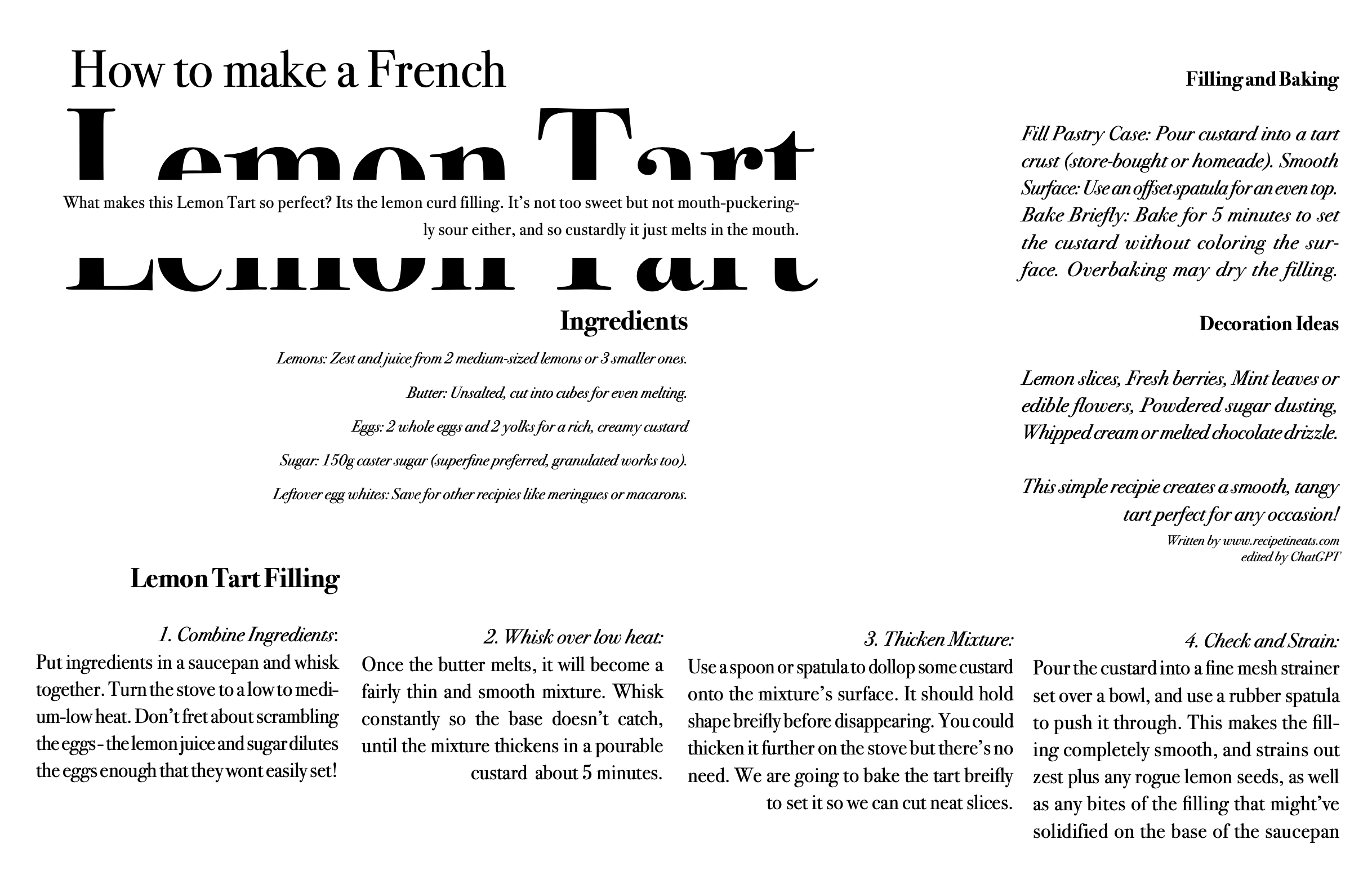
PHASE 3
No restraints, free to use any type size, weight or face


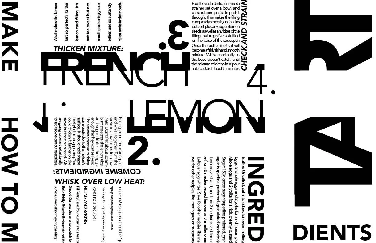
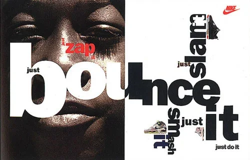
PHASE 4; FINAL
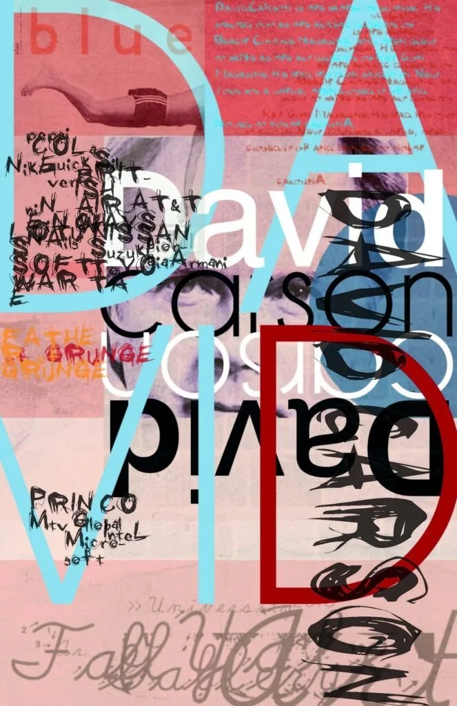
This final phase is where I was assigned to push the readability of typography as far as I could image. Instead of focusing on communication I was to use what I have learned so far staying within restraints and grids, to break those while still referencing a heirarchy of typography. I used David Carson’s work to learn from to see different methods of deconstructing typography.
INSPRIRATION

FIRST DRAFT

FINAL REVISION